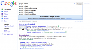
The rumoured redesign of the new Google homepage is still hidden for most users today but Goog is now confident enough to start rolling it out… a full worldwide launch should not be very far away right? In fact yesterday it was the US, today Spain has the new interface avaiable….
Starting with the logo, big G has finally got rid of that annoying 3D/shadowy effect which they’ve been using for more than a decade! … and come back to the basics with brighter & softer colors, a more spacious search box & slightly bigger buttons (which don’t rely on the native UI of your operating system anymore).. everything seems much more aired, spaced & lighter… everything is where it should be.
The new results page has a two panel layout (which comes to substitute the previous optional “show options” column) with more intuitive filter results (news, images, videos, blogs, maps, shopping..). By default & depending on the subject you’re looking for, this menu adapts with the most common filters.

Therefore if you’re looking for a street “maps, images & news” categories will come up as the main choices, if you tap a hot twitter search “updates” is the most logic filter & if you search of the UK election then “discussions, news & updates” will be on top.

…. has the simplistic-minimalistic turn in Microsoft’s product design influenced G? Neh….
[tweetmeme]